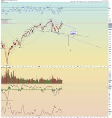
A Simple Chart Is a Persuasive Chart
The most anti-persuasive thing you can do is make a bad chart that frustrates people. Your credibility suffers if people can’t make sense of your visual. So you want to avoid a couple pitfalls.
First, beware of complexity. If there’s too much information and no clear, salient point that people can intuit, they tend to shut down unless they have time to find your narrative.
Too many salient points fighting for attention is often the result of poor design. So when trying to make a persuasive chart, keep in mind: “If everything is bold, nothing is.”
Next, be wary of unusual chart treatments. People often struggle with visuals that flout convention – for example, if you depict time going right-to-left, or put values out of order (very likely, not likely, somewhat unlikely, somewhat likely).
Any time people’s expectations are messed with, it requires cognitive gymnastics to get things straight. If it’s too much of an effort, they’ll give up.
This post has already been read 1029 times!


Post Comment